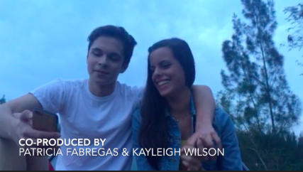


We wanted a very clean, crisp font for our credits because our main character is going to be portrayed as a clean young woman and then the irony will be shown once the murder scene is shown. They're all four seconds apart, so we can have a uniformed look to it. We decided to include only the actors, and ourselves (the directors/producers). We did this because based on other horror film openings, they usually only include the most important people, including actors with the most influence or screen time, and the makers of the film.

This is the font we will be using for our title, The Death Trail. The font size will gradually get bigger, making it seem like the title is coming towards the camera, and consequentially, towards the viewer. This parallels with how though the killer has struck, she is not done, and is going to kill more victims.
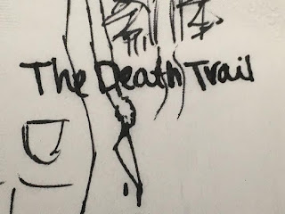 The title will not be on this plain black screen seen above. That is only because we still need to get the final shots of the opening. But the picture on the right shows a rough drawing of the final shot with the title in the middle of the screen. One can see "the death trail" in the background, the killers body walking away on the left third, and the knife, dripping with blood, in the middle lower section of the screen.
No comments:
Post a Comment